months from the first idea to a fully assembled brand ecosystem
Featured case / Brand + Digital
Dikaya Tish
A complete launch of a tea brand: from the concept, logo, and packaging to the communication system and a working website.
Open the site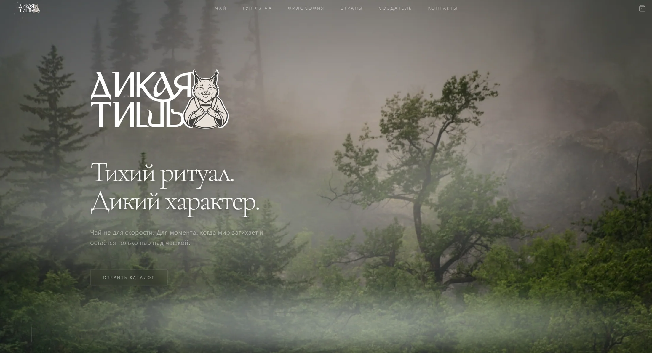
single system for product, communication, and digital
tea line directions within a single architecture
identity, packaging, content, and website
We built a brand in which tea becomes a personal, quiet ritual.
Dikaya Tish began not with a single label or a website page, but with a complete idea. We shaped the brand's image, designed a logo with a distinctive character, and built a visual system around nature, an inner pause, and mindful brewing.
Over three months the project went the whole distance: a typographic system, a color palette, packaging options, a line of flavors, touchpoints, communication, and a digital storefront. Every part supports the shared character and helps the brand look recognizable at any point of contact.
Brand foundation
The character came before the touchpoints.
The logo, the image of the lynx, the letterforms, and the calm typography shape a recognizable voice — natural, confident, and free of visual noise.
01 / Logo
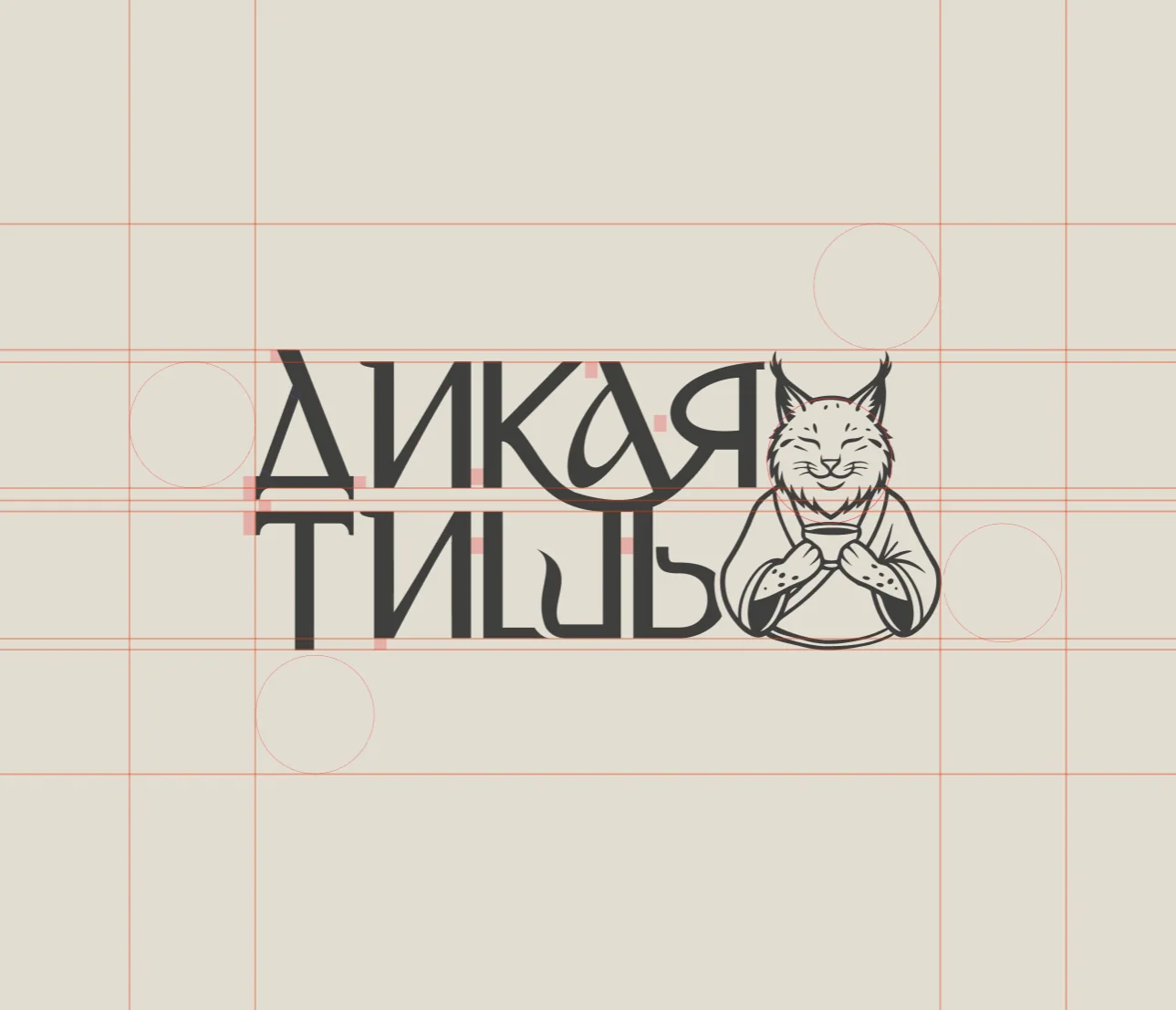
Word and character form a single mark.
The custom lettering of the name is joined to the image of a calm lynx. The construction holds its character both in a large composition and on a small label.
02 / Concept
The primal power of the leaf. A quiet brewing ritual.
The semantic platform connects living nature with a state of inner pause and sets the direction for the entire visual system.

Design system
One system for product and communication.
We collected the rules the brand scales by: a line of flavors, gift sets, packaging details, posters, social media, signage, and point-of-sale materials.
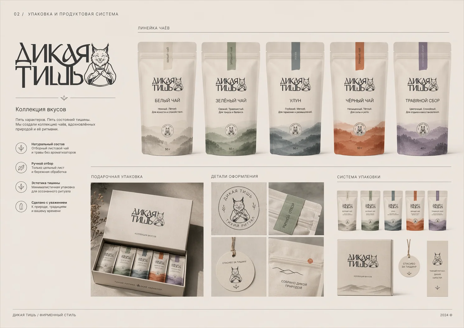 Identity system / Packaging
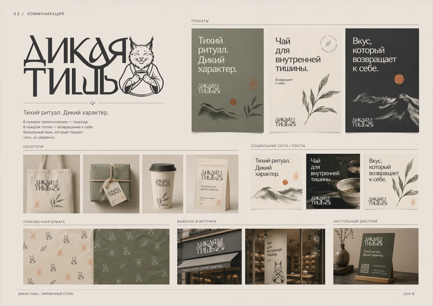 Identity system / Communication
Packaging
The line differs by flavor, yet stays a single brand.
We tested several compositional directions, chose botanical imagery, and built a hierarchy that makes it easy to read the variety, origin, and character of the tea at a glance.
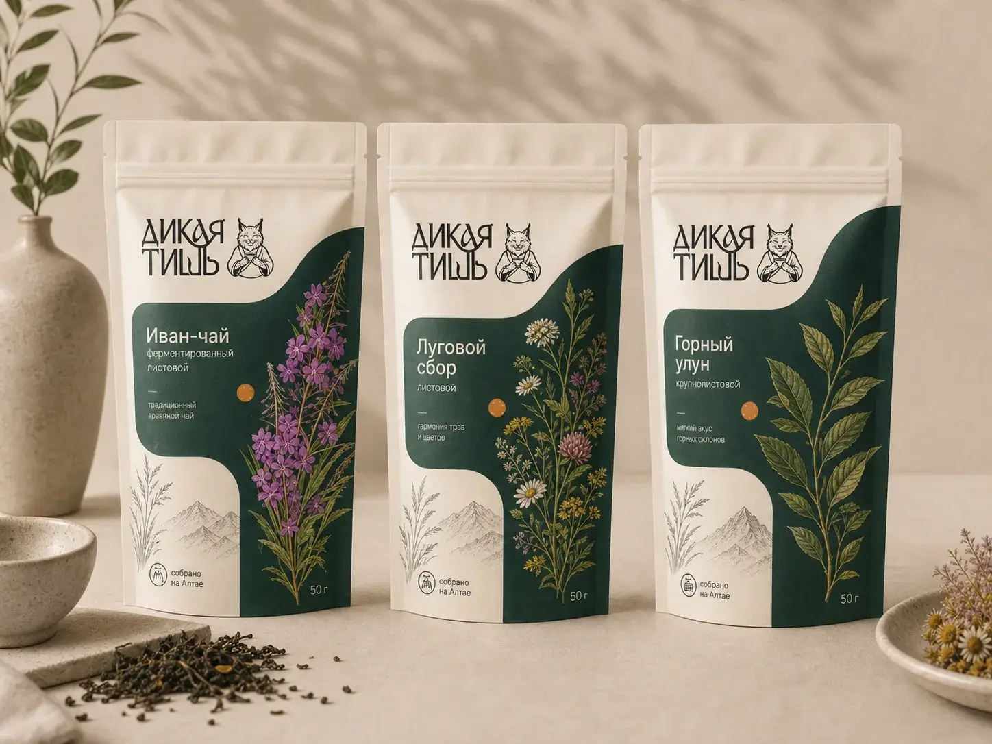 Packaging / Direction 01
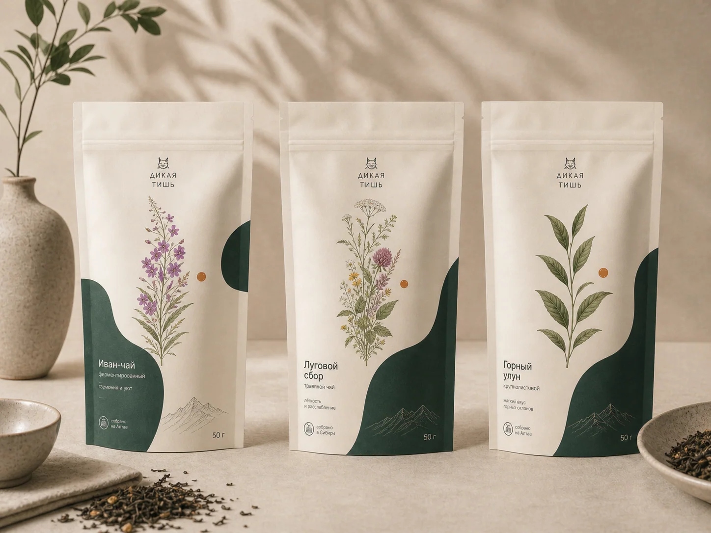 Packaging / Direction 02
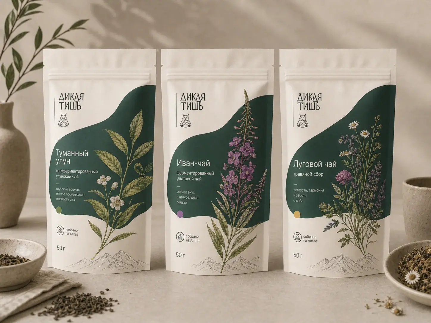 Packaging / Direction 03
Labels and prepress
The concept is carried through to a real product.
For the key varieties we assembled complete labels: the name in two languages, ingredients, legal information, marking, a QR code, and an expressive product image.
 Ivan Chai / Label system
 Sencha / Label system
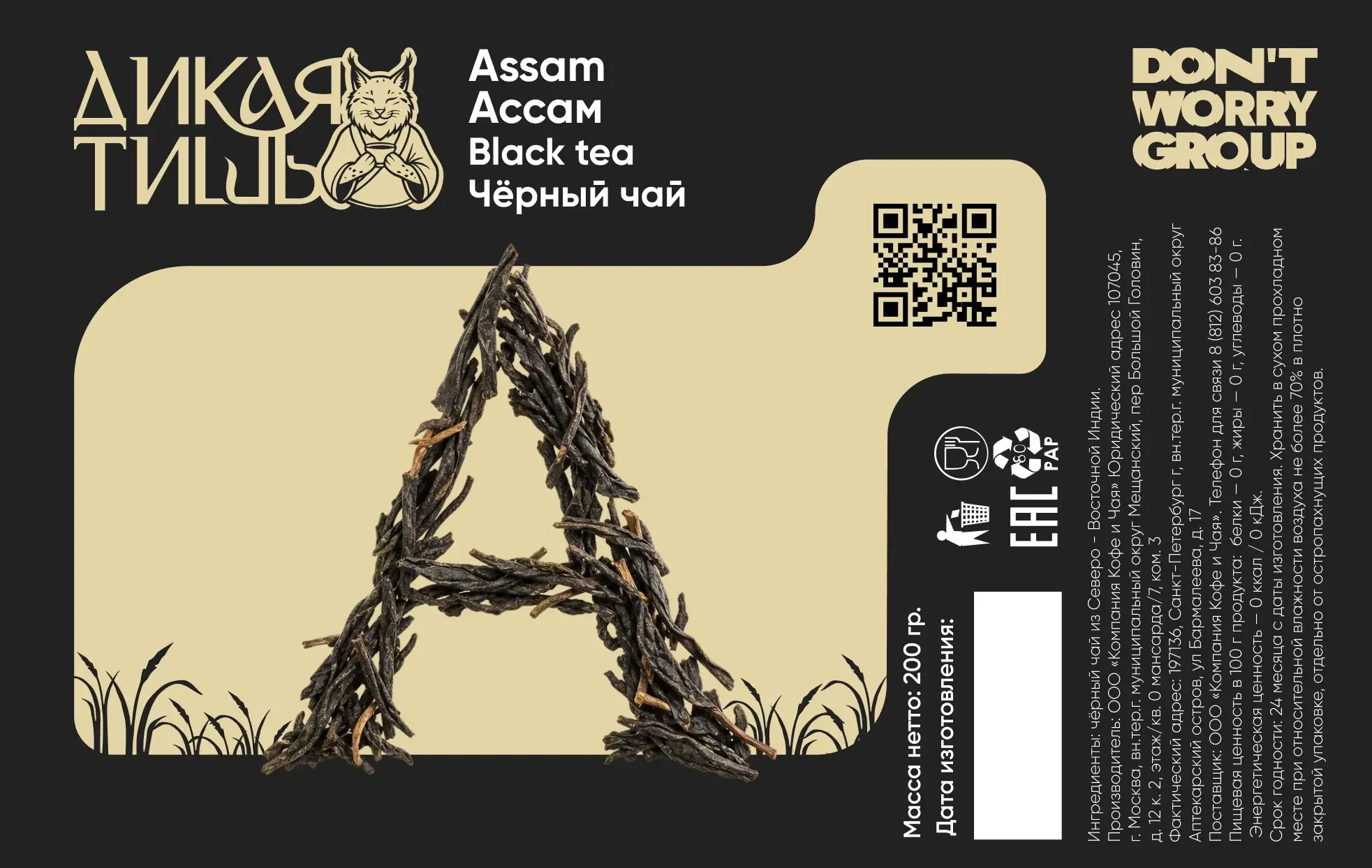 Assam / Label system
Versatility
The system holds different packaging personalities.
From the light botanical line to the contrasting black series and the gift set, recognizability is held by the logo, the typography, and the shared rhythm of composition.
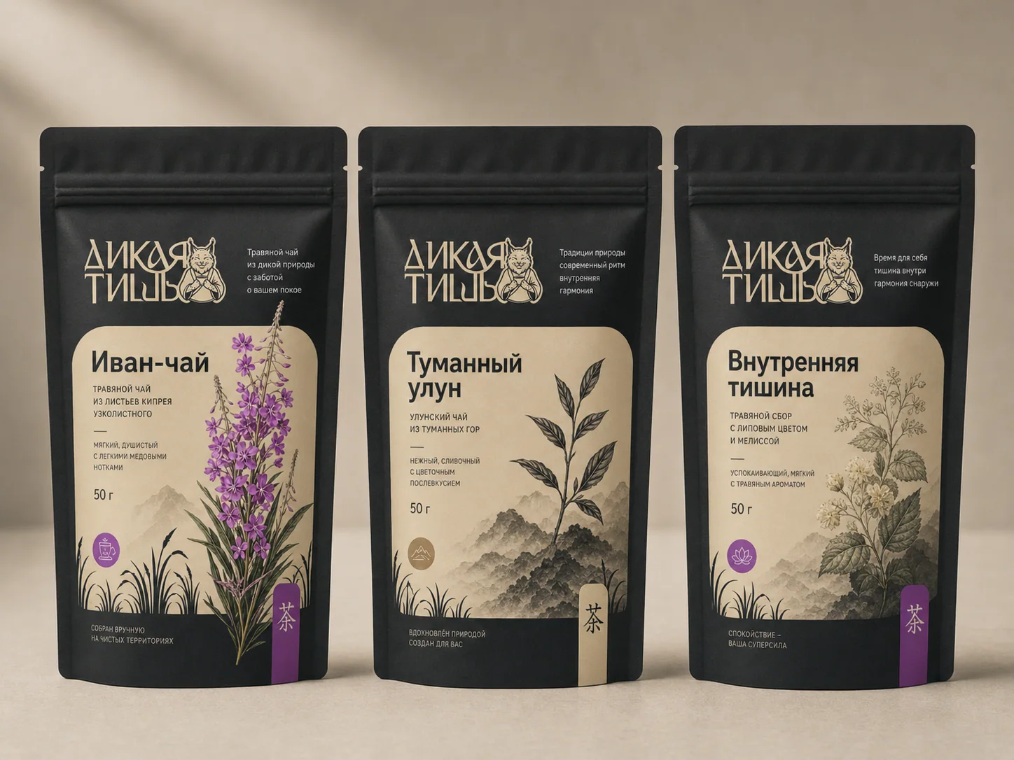 Black packaging series
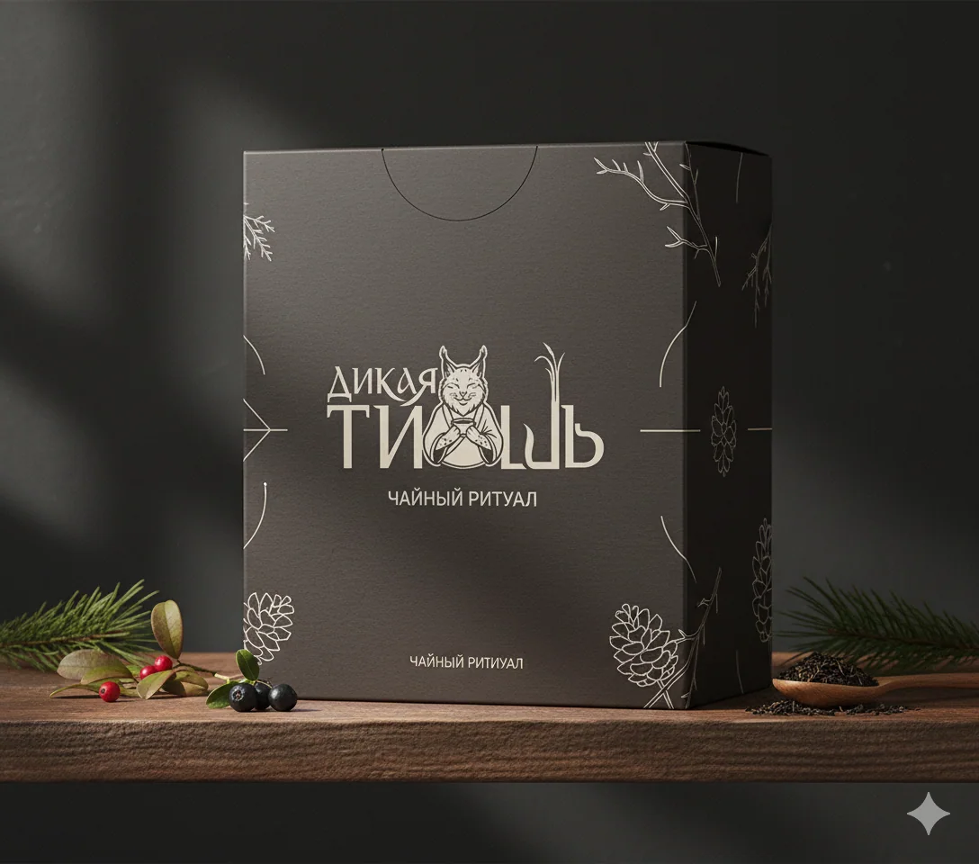 Gift box
Digital
The site extends the brand and shows the product in its natural environment.
We carried the Dikaya Tish atmosphere into the digital space: large typography, misty natural scenes, a calm rhythm, and clear navigation through the products and the brand's philosophy.
Website / Live experienceWhat the team did
Three months. One brand story.
The project unites strategy, design, and digital into a system ready for launch, line expansion, and consistent communication.
Concept
The brand image, positioning, and semantic platform.
Logo
Custom lettering, a character, and the rules of the mark's composition.
Typography
A contrasting pair of typefaces for character and clear hierarchy.
Packaging
Design options, a line of flavors, and finished labels.
Identity
Touchpoints, promotional materials, and communication rules.
Website
The design and development of the brand's digital storefront.