color variants of the RED product packaging
Case 03 / Brand + Packaging + Motion
RED × Don’t Worry Group
A coffee company's visual system: identity, the RED product line, packaging, and a motion presentation of the brand.
single system of brand and product communication
motion film for the company's visual presentation
scenes, materials, light, and product animation
We brought product packaging and the company's character together in a single visual world.
Don’t Worry Group works inside the coffee industry: it roasts coffee, develops an engineering and service direction, and helps businesses build their work with equipment and product.
The case brings together two levels of the brand. RED is responsible for the bright product line, while Don’t Worry Group stands for the company's expertise, technological depth, and scale. A shared art direction tied packaging, 3D visualization, and video into one coherent presentation.
Don’t Worry Group
The company's expertise found its own visual identity.
Deep green, the texture of fabric, and contrasting typography create a calm, confident environment for a brand that unites coffee, equipment, and service.
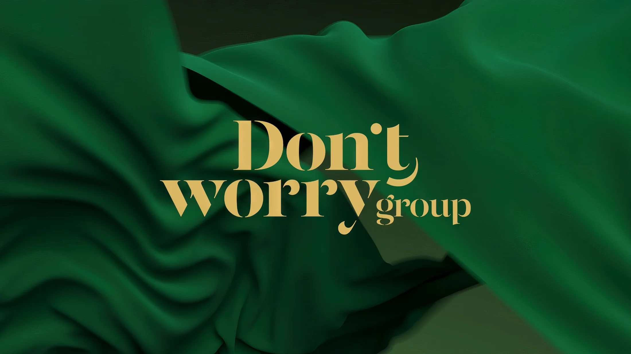 Don’t Worry Group / Identity
RED / Coffee
The packaging carries the product's emotional charge.
Large typography, a bold red accent, and a clear product hierarchy help the line stand out while telling the story of each blend's flavor.
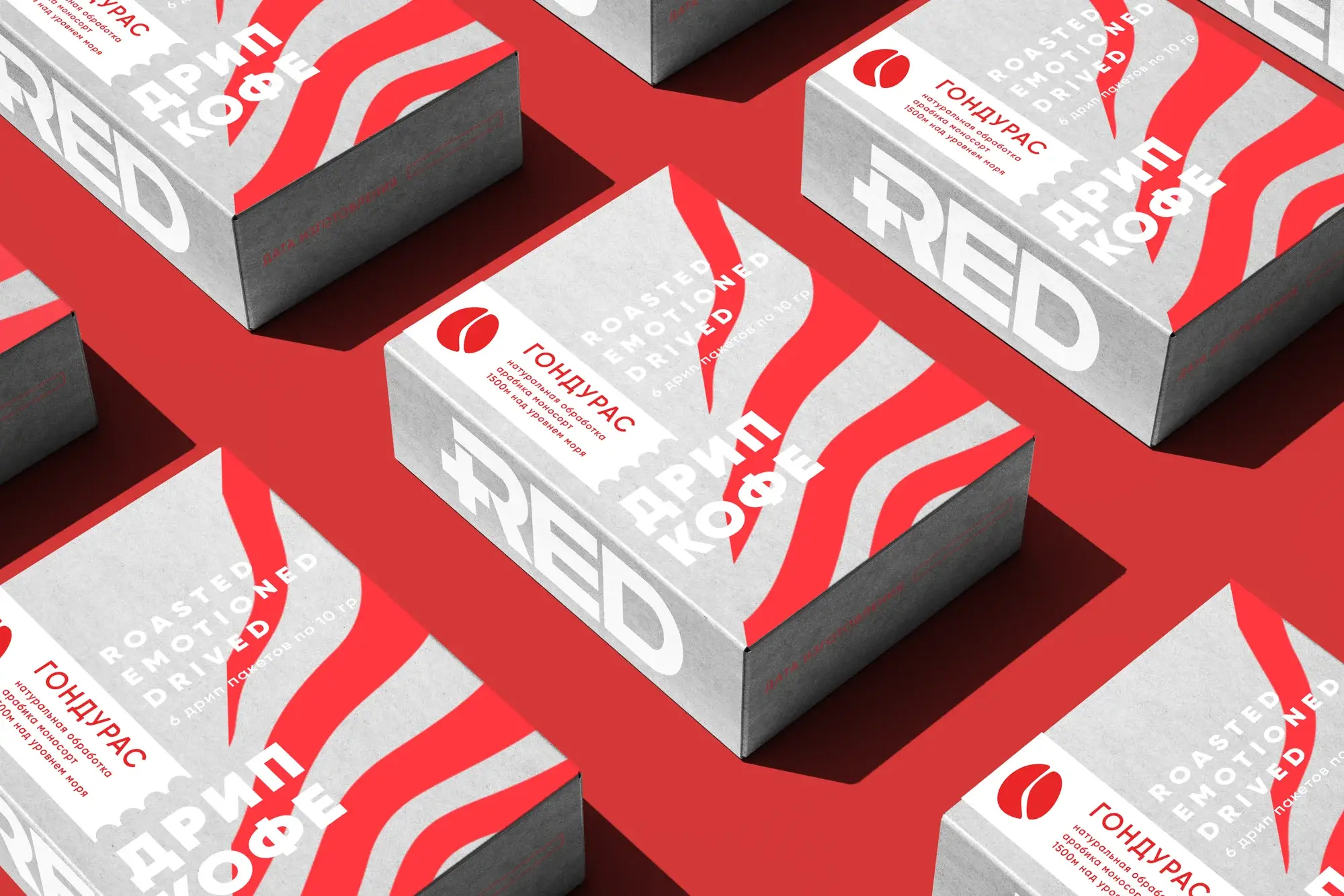 RED / Wave direction
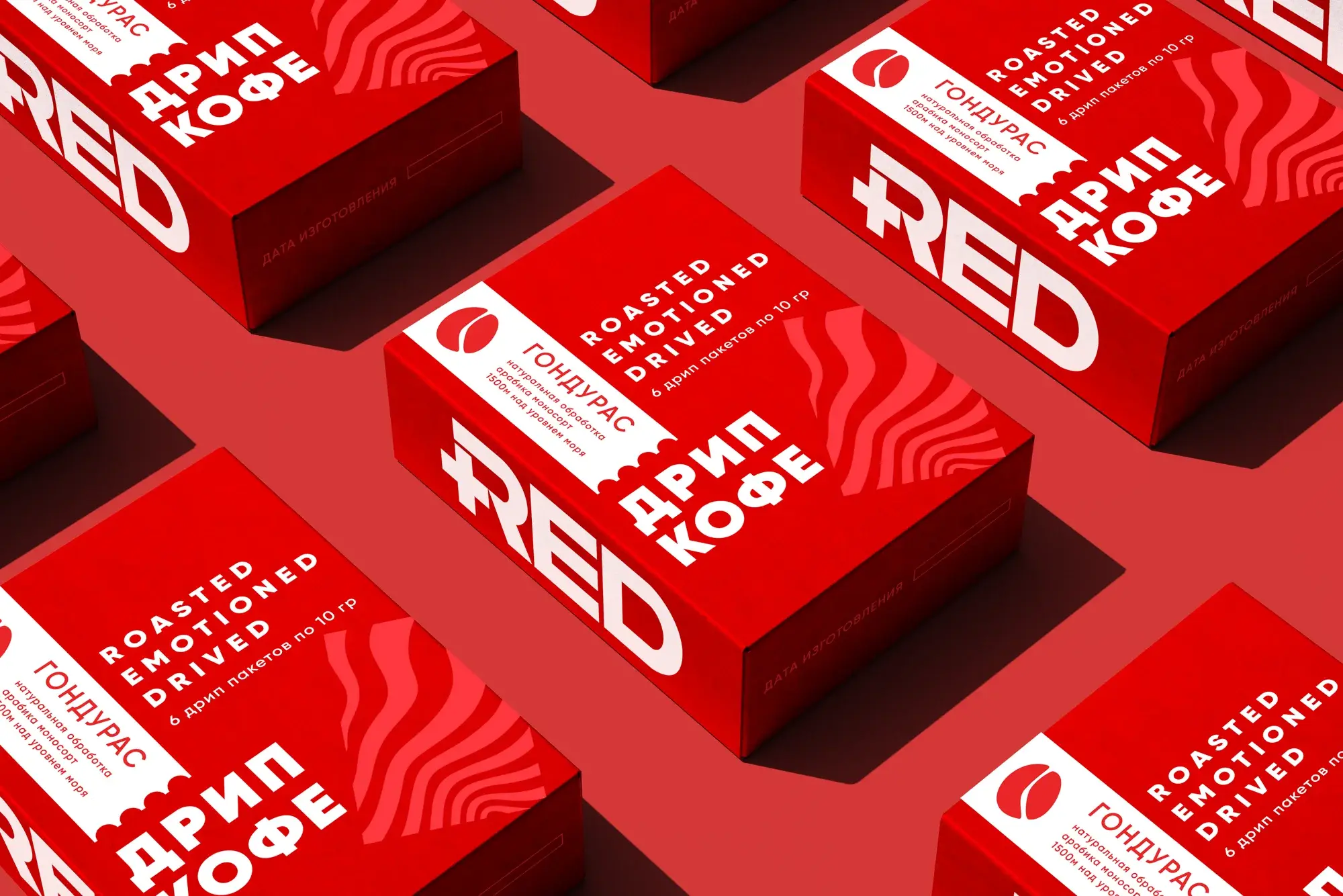 RED / Core direction
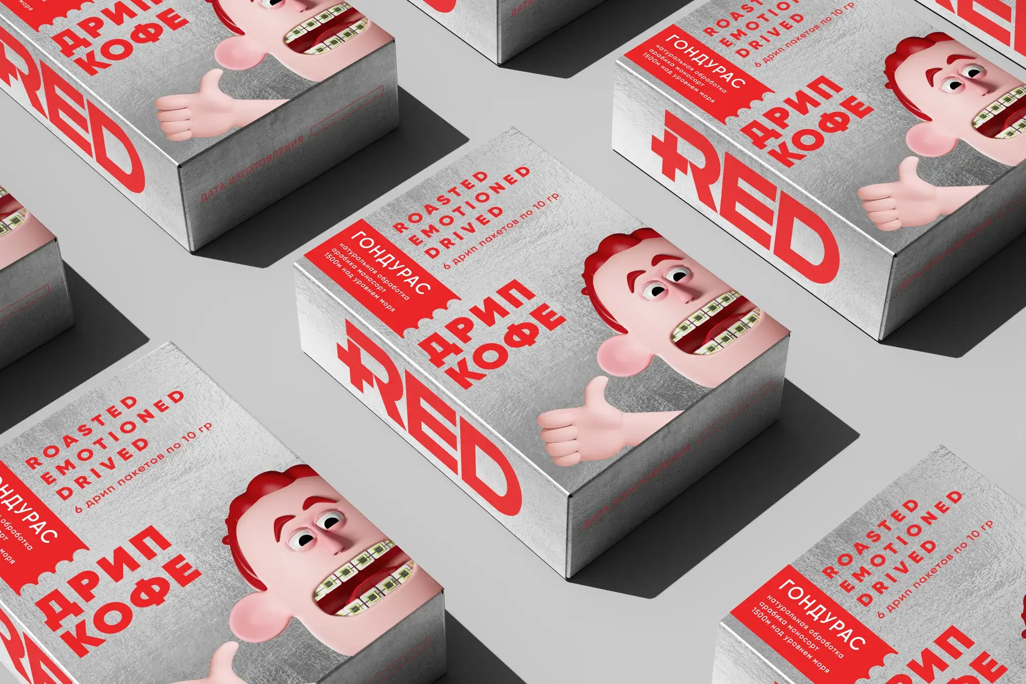 RED / Alternative direction
Prepress
The design is taken all the way to the physical product.
The dielines account for the packaging structure, fold zones, barcode, ingredients, food labeling, and required information.
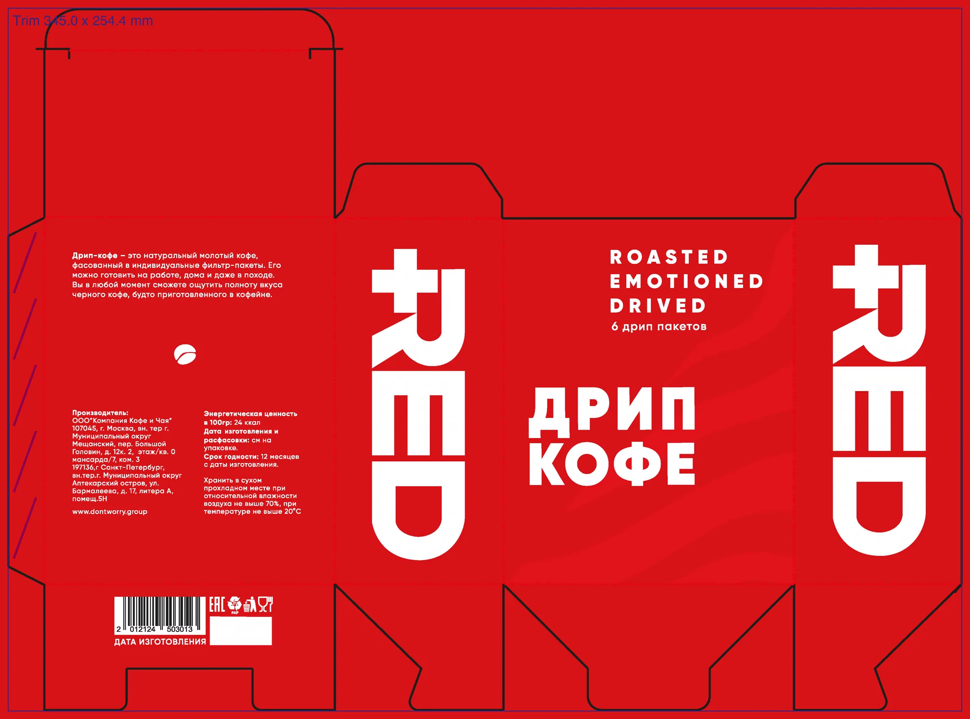 Production dieline / Red
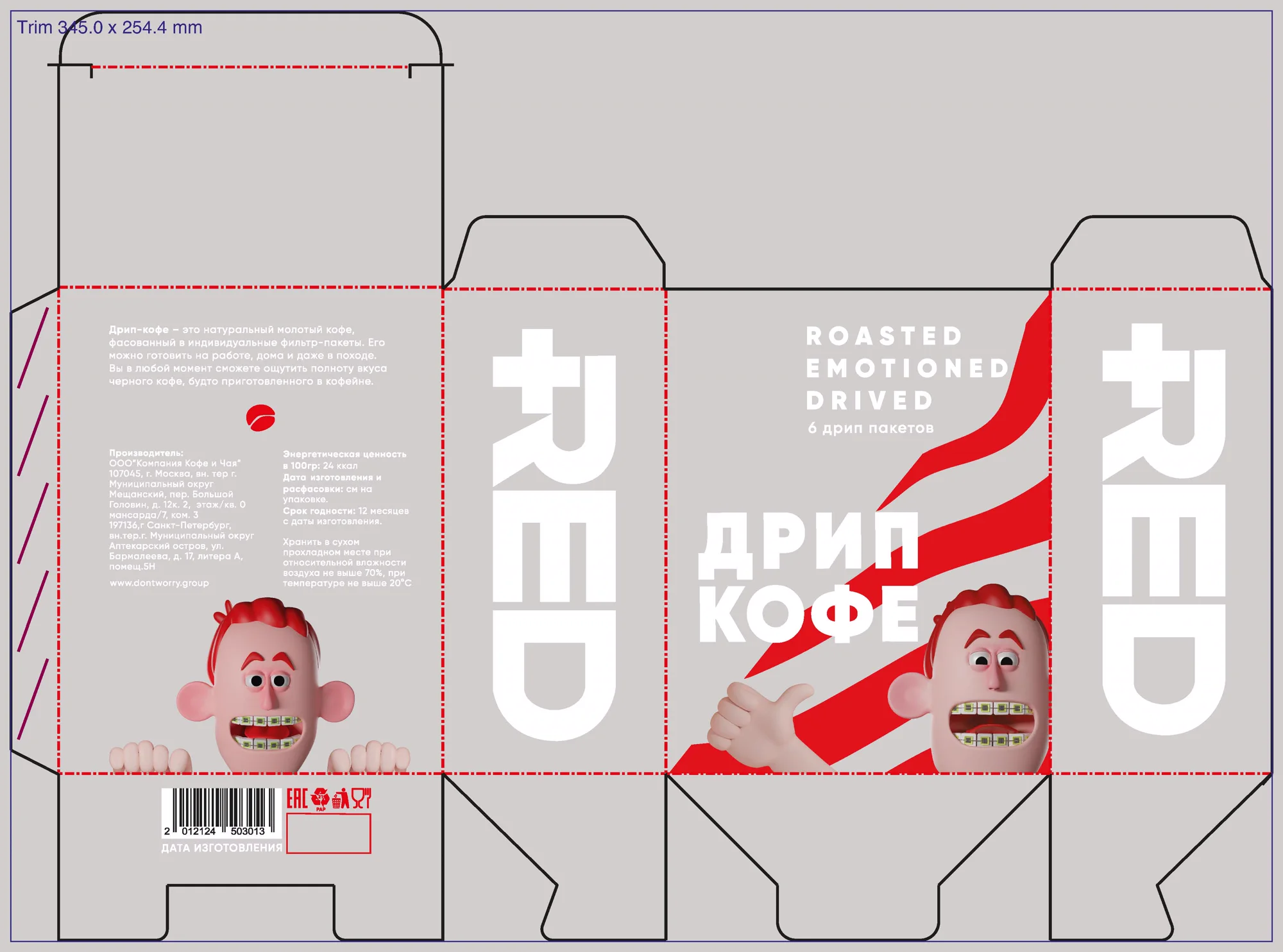 Production dieline / Light
Motion presentation
The packaging became the hero of the film.
For the brand presentation we built 3D scenes with the product, tuned materials, fabric, light, and camera movement. The final film was assembled in Cinema 4D, After Effects, and Premiere Pro.
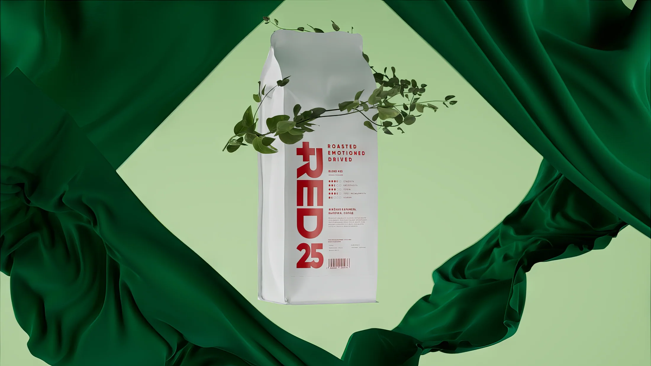 Cinema 4D / Product scene
What the team did
From the product system to the final frame.
The case unites physical product design and its presentation in motion — with no gap between packaging, 3D, and brand communication.
Art direction
The shared visual character of RED and Don’t Worry Group.
Packaging
Line architecture, labels, and product hierarchy.
3D visualization
Bags, materials, light, and scenes for the product presentation.
Cinema 4D
Scene building, camera movement, and object animation.
After Effects
Compositing, typography, color, and final frame dynamics.
Premiere Pro
Editing and assembling the presentation film into one coherent story.